How To Design A Powerpoint Template
Designing a compelling PowerPoint presentation is more than just slapping some text onto slides. It’s about creating a visual narrative that engages your audience and effectively communicates your message. A well-designed PowerPoint template isn’t just about aesthetics; it’s a strategic tool that can significantly impact your presentation’s success. This guide will walk you through the essential steps to creating a powerful PowerPoint template, covering everything from choosing a style to implementing effective design elements. How To Design A Powerpoint Template is the foundation for a polished and impactful presentation. Let’s dive in.
Understanding the Importance of a Template
Before we begin, it’s crucial to understand why a PowerPoint template is so valuable. A template provides a starting point, saving you valuable time and effort. Instead of starting from scratch, you can leverage a pre-designed template that incorporates best practices for layout, color, and visual hierarchy. This ensures a consistent and professional look, regardless of the content you’re presenting. Furthermore, templates offer a framework for consistent branding, making your presentations feel more cohesive and memorable. They’re an investment in your presentation’s overall quality.
The right template can dramatically improve your presentation’s perceived professionalism. A poorly designed template can distract from your message, making it harder for your audience to focus. A well-crafted template, on the other hand, guides your design choices, ensuring a polished and engaging experience. Choosing the right template is a critical first step in the presentation design process.
Key Elements of a Successful PowerPoint Template
A truly effective PowerPoint template goes beyond simply choosing a pretty color scheme. It’s a carefully considered combination of elements that work together to create a visually appealing and informative presentation. Here’s a breakdown of key elements:

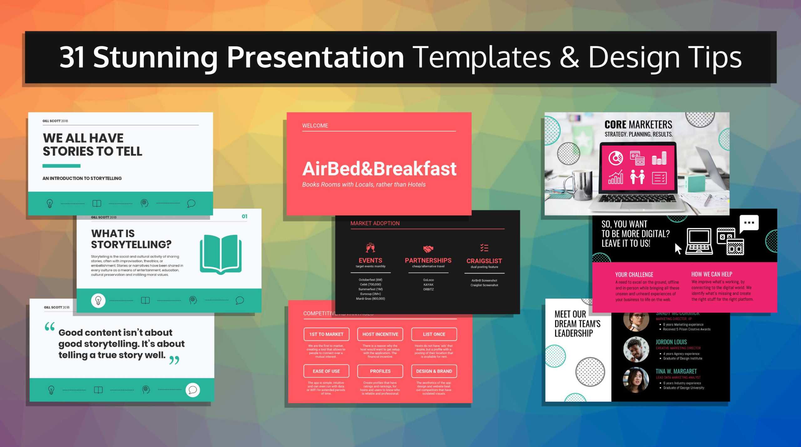
- Color Palette: A limited color palette (typically 2-4 colors) is generally more effective than a chaotic mix of bright hues. Consider the psychology of color – warm colors tend to be inviting, while cool colors can convey seriousness or sophistication. Ensure sufficient contrast between text and background for readability.
- Typography: Select fonts that are legible and appropriate for your audience and the overall tone of your presentation. Stick to 2-3 fonts maximum. Use different font sizes and weights to create visual hierarchy. Sans-serif fonts are often preferred for digital displays, while serif fonts can lend a more traditional feel.
- Layout & Grid: A consistent layout is essential. Utilize a grid system to align elements and create a sense of order. This helps guide the viewer’s eye and makes the presentation easier to follow. Consider using a balanced layout – elements should be distributed evenly across the slide.
- Imagery & Graphics: High-quality images and graphics can significantly enhance your presentation. Use visuals that are relevant to your content and support your message. Ensure images are properly sized and optimized for web viewing. Consider using icons to visually represent concepts.
- Animations & Transitions: Use animations and transitions sparingly and purposefully. Overuse can be distracting and detract from the message. Subtle animations can add visual interest, but avoid anything that feels gimmicky.
Template Styles: A Quick Overview
There’s a vast array of PowerPoint templates available, each with its own unique style and aesthetic. Here are a few popular categories:

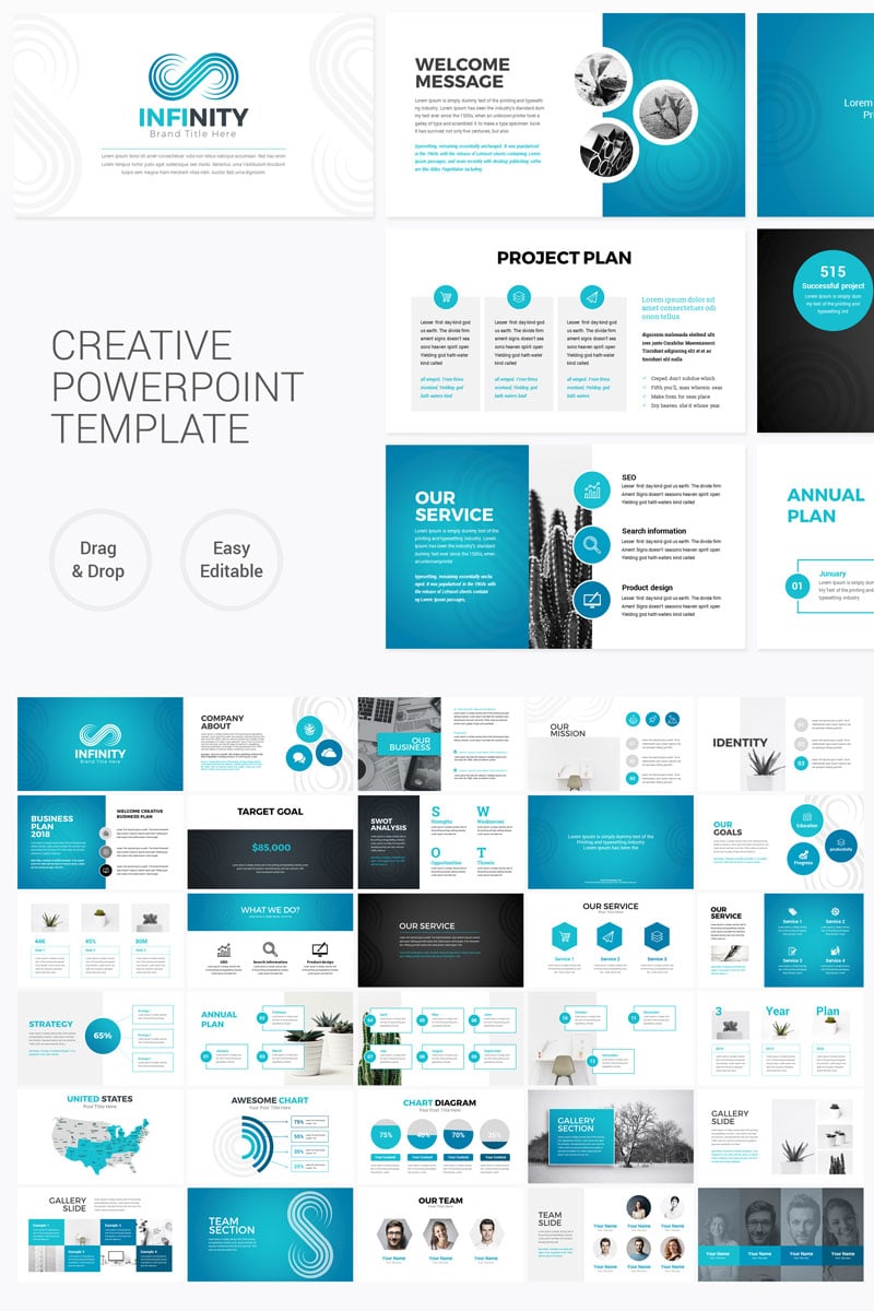
- Minimalist: Clean, simple designs with a focus on white space. Ideal for conveying professionalism and clarity.
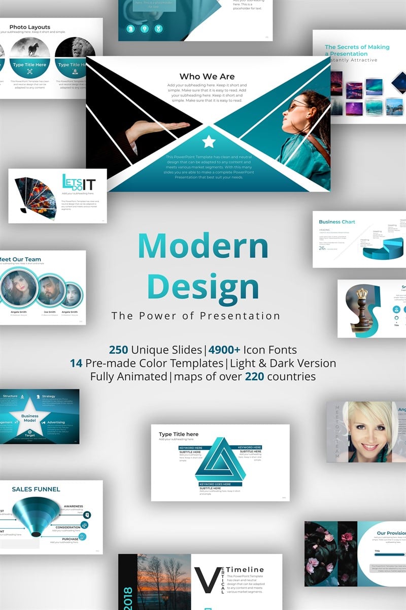
- Modern: Bold colors, geometric shapes, and a contemporary feel. Suitable for presentations that want to appear cutting-edge.
- Classic: Traditional layouts, elegant fonts, and muted colors. Often used for formal presentations or industry reports.
- Creative: More playful and unconventional designs. Best suited for presentations that want to stand out and capture attention.
- Data-Driven: Templates specifically designed for presenting data and statistics, often incorporating charts and graphs.
Finding and Adapting Templates
Fortunately, there are numerous resources available to help you find and adapt PowerPoint templates:
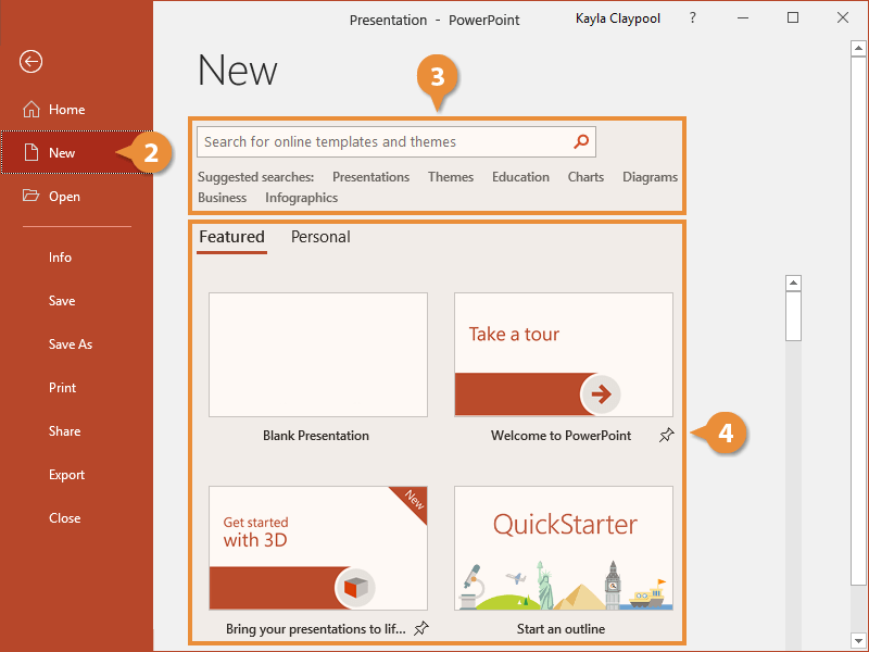
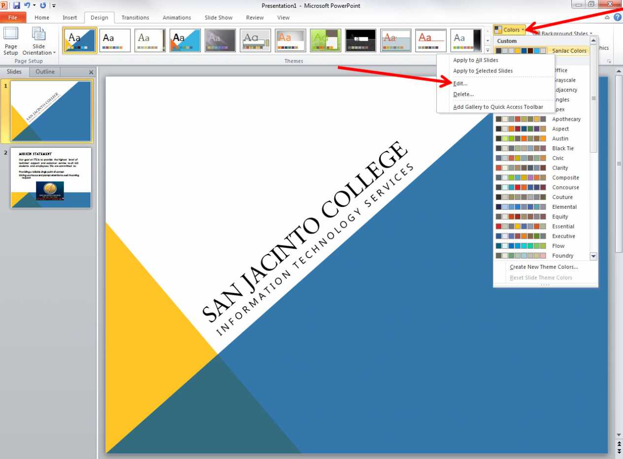
- Microsoft PowerPoint Templates: The built-in template library within PowerPoint offers a wide selection of pre-designed templates.
- Microsoft Templates: A separate Microsoft template library provides a broader range of options.
- Canva: Canva offers a vast library of free and premium templates, including many PowerPoint-compatible designs.
- Envato Elements: A subscription-based service that provides access to a huge collection of templates, graphics, and stock photos.
- SlideShare: A platform where users share and download PowerPoint templates.
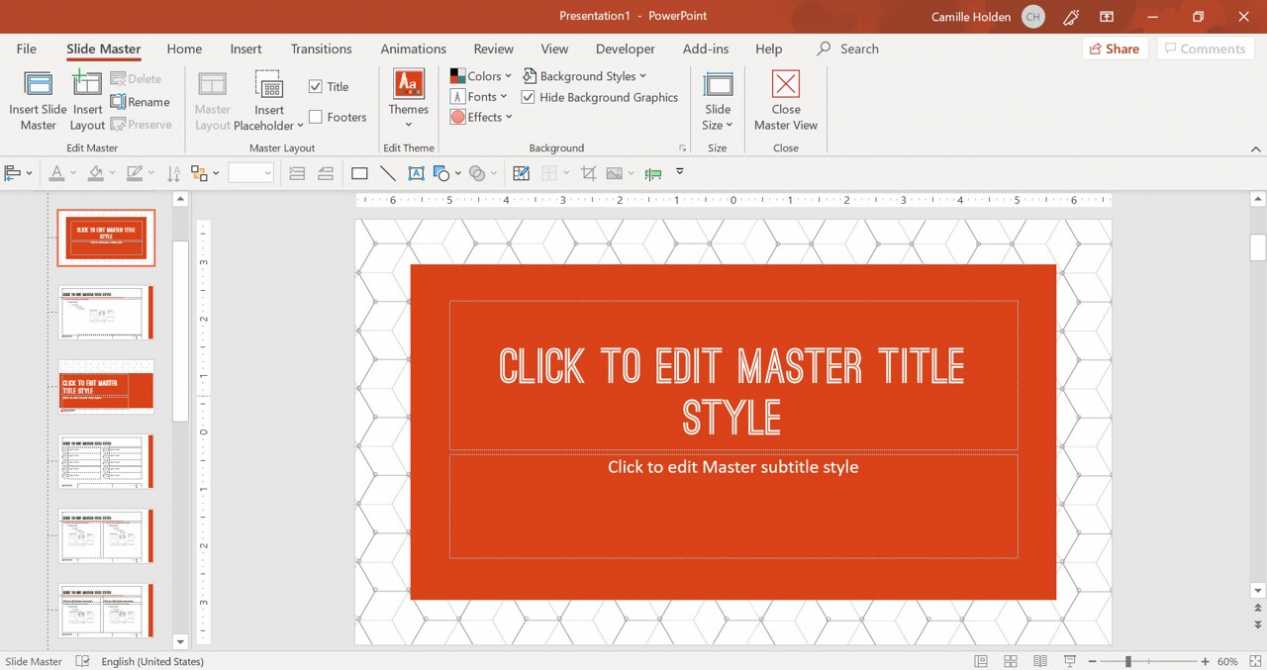
When adapting a template, remember to customize it to fit your specific needs. Don’t just copy and paste – tweak the colors, fonts, and layout to create a unique and effective presentation.
Beyond the Basics: Advanced Design Techniques
While a solid template is essential, going beyond the basics can elevate your presentation to the next level. Here are a few advanced techniques:
- Microcopy: Adding brief, impactful text to your slides (e.g., “Key Takeaway:…”) can guide the audience’s attention and reinforce your message.
- Data Visualization: Transforming data into compelling charts and graphs can make complex information easier to understand. Choose the right chart type for the data you’re presenting.
- Storytelling: Structure your presentation as a narrative. Use a clear beginning, middle, and end to engage your audience.
- White Space: Don’t be afraid to leave empty space on your slides. White space helps to draw attention to key elements and improves readability.
Maintaining a Consistent Brand Identity
A PowerPoint template is more than just a visual aesthetic; it’s a reflection of your brand. If you’re presenting for a business, ensure your template aligns with your company’s branding guidelines. This includes using your logo, colors, and fonts consistently across all your presentations. Consistency builds recognition and reinforces your brand identity.

The Importance of Testing and Feedback
Before finalizing your PowerPoint template, it’s crucial to test it thoroughly. Present your presentation to a small group of colleagues and ask for their feedback. Observe how they react to the design and make any necessary adjustments. Getting feedback from others can help you identify potential problems and ensure that your template is effective.

Conclusion: Creating a Powerful PowerPoint Template
Designing a PowerPoint template is a skill that can significantly enhance your presentation’s effectiveness. By understanding the key elements of a successful template, utilizing available resources, and incorporating advanced design techniques, you can create presentations that are visually appealing, informative, and memorable. Remember that a well-designed template is an investment in your presentation’s success. How To Design A Powerpoint Template is a fundamental skill for any professional presenting information. By consistently applying these principles, you can elevate your presentations and leave a lasting impression on your audience. Investing time in creating a polished and professional template is a worthwhile endeavor that will pay dividends in terms of audience engagement and overall presentation impact.